Saturday, July 14, 2012

Correlation Matrix

A correlation matrix displays a variety of data in a rectangular form. The matrix allows the display of a variable and the correlation of the additional data. Within the matrix, when same variables are compared, the value/coefficient is always 1 and is shown diagonally within the chart.
The example correlation matrix is the data from the assessment of lipid compounds and phosphorus in mangrove sediments of Santa Catarina Island, SC, Brazil

Similarity Matrix


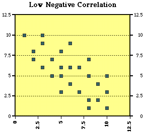
A similarity matrix displays data for two variables or points. These are shown within an X and Y graph. This allows the visual representation of the similarities between the two variables.

The example map is of the ratings by the subject matter expert raters SME raters for a selected group of baseball athletes.

Stem and Leaf Plot

A stem and leaf plot displays a plot which displays quantitative data. The plot shows a minimum of two important values. The plot is divided into a left and right column. The left is known as the stem and the right is known as the leaf. There is only one stem, but there can be multiple leafs.
The example map is of a stem and leaf plot. This plot is an example and illustrates the grades of a fictional class and a fictional test.

Box Plot


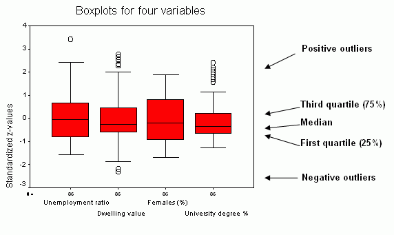
A box plot is a graphical display by an interval scale. The plot displays the distribution, central values and variability’s of the data. If any of the data is not within the designated box plot graph, then the information is known as outliners and is generally noted with an asterisk.

The example map, “Illustrates that there are positive outliers for three variables and negative outliers for one variable. The variable Females(%) does not have outliers at all. In addition to outliers, there can be positive or negative extremes extending the value of three interquartile ranges above the third quartile and below the first quartile. None of the analyzed variables has extremes. Eliminating outliers and extremes (for example, negative outliers or extremes for zero representing no data), can change radically the distribution of a variable.” Per the web citation.

Histogram

A histogram, also known as a frequency distribution graph, represents various ranges of data and are plotted within an X and Y axis. This graph can abridge large amounts of data.
The example map is of the "average value of dwelling variable, but this time with marked class breaks. With this particular distribution, class breaks are defined based on the ±0.5, ±1.5 and outside of±1.5 standard deviations from the mean value." This information is per the website.

Parallel Coordinate Graph


A parallel coordinate graph displays high-dimensional geometry. In addition, the parallel coordinate graph connects the values of one variable. This allows the user to understand the relation or connection of multiple variables.

The example map is of a random graph for a lecture by Alfred Inselberg, who invented the parallel coordinate graph. He was giving a lecture at Columbia University in 2007.

Triangular Plot


A triangular plot displays three points of selected variables. These points in the plot display the point of the variable where the proportions are equal to one.
The example map is an example from an article about triangular plots.

Windrose

A windrose displays information about the wind over a designated point in time. The windrose was used in sea travel, before magnetic compasses were invented. Currently, the windrose is used in meteorology to communicate how often the wind occurs within a given period. The windrose has eight lines, which are proportional to the frequency of the occurring wind. The center of the windrose provides the information of calm air.
The example map is of Fresno, California in 1961. The information was gathered at the Fresno Air Terminal.

Climograph


A climograph displays information of the temperature and or precipitation for selected areas. The information is gathered over a designated period, while temperature is displayed in a bar graph form, the precipitation data is shown on a line graph.

The example map is of the temperature and precipitation for Memphis, Tennessee.

Population Profile

A population profile displays information on collected on the population within a specified. The information is displayed within a chart format, and information is identified along the x-axis.
The example map is of Northern Ireland’s population : 1971-2045 (2008-based projections.)

Scatterplot


A scatter plot displays bivariate data within a form of a graph. The graph will show the relationship of the two variables, any connection pattern of the data.

The example map is of a scatter plot map lecture from the University of MSTE in Illinois.

Index Value Plot

An index value plot allows data to be displayed and compared to the index point.
The example of the index value plot description has been directly taken from the examples website, “The AMO index is correlated to air temperatures and rainfall over much of the Northern Hemisphere, in particular, North America and Europe such as North Eastern Brazilian and African Sahel rainfall and North American and European summer climate.”

Accumulative Line Graph or Lorenz curve


An accumulative line graph, which can also be known as a Lorenz curve displays economic quantities and the distribution of wealth and income. The Lorenz graph shows the wealth distribution; degree of inequality.

The example of a Lorenz curve example which shows the inequality in the distribution of income within an example lecture.

Bilateral Graph


A bilateral graph displays two or more variables or sets of data within form of a graph.

The example of a bilateral graph illustrates a company’s potential to maximize profits without becoming a monopoly within the market. This graph also illustrates how the company can set the price within the market within their profit margin.


Nominal Area Choropleth Map


A nominal area choropleth map displays data, which cannot be measured or calculated. The data is grouped, labeled, and randomized. The groupings are represented by color or patterns

The example map is of an example nominal area map, from the explanations on cartographic symbolization and design within ARC/INFO Methods


Unstandardized Choropleth Map

An unstandardized choropleth map is a thematic map, which shows non-averaged data. This data is represented as the original data, within the original area.
The example map is of Sao Paulo, in 1991, it show the population districts within the city. The left side of the map shows the unstandardization of the map, while the right side of the map shows the standardization if the map.

Standardized Choropleth Map


A standardized choropleth map is thematic map, which shows averaged data. The averaged data is represented within one area or unit of the map.

The example map is of Sao Paulo, in 1991, it show the population districts within the city. The right side of the map shows standardization, which the left shows the unstandardization of the map.

Univariate Choropleth Map


A univariate choropleth map is form of thematic maps, which shows the informational reflection of one variable, or one set of related data.

The example map is of rental prices, the map data is from an unknown date. The post where the map was obtained was dated January 5, 2006.

Reference URL: http://statgraphics.blog.com/page/2/

Bivariate Choropleth Map


A bivariate choropleth map shows two variables on the same map. The information is represented by two different symbols and shows the relationship of the variables.
The example map shows which canidate won each of the 50 U.S. States during the 2008 election.

Unclassed Choropleth Map


A unclassed choropleth map uses a continuous grade change in color to represent a range of values. This map can be a great number of color hues and thus can be easily misread.
The example map shows the birth rates for the state of Orgeon for 2001.