Saturday, July 14, 2012

Correlation Matrix

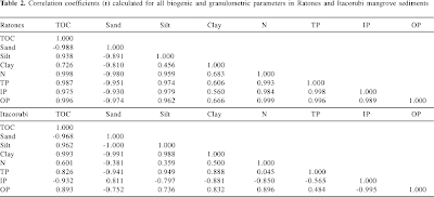
A correlation matrix displays a variety of data in a rectangular form. The matrix allows the display of a variable and the correlation of the additional data. Within the matrix, when same variables are compared, the value/coefficient is always 1 and is shown diagonally within the chart.
The example correlation matrix is the data from the assessment of lipid compounds and phosphorus in mangrove sediments of Santa Catarina Island, SC, Brazil
Similarity Matrix


A similarity matrix displays data for two variables or points. These are shown within an X and Y graph. This allows the visual representation of the similarities between the two variables.

The example map is of the ratings by the subject matter expert raters SME raters for a selected group of baseball athletes.

Stem and Leaf Plot

A stem and leaf plot displays a plot which displays quantitative data. The plot shows a minimum of two important values. The plot is divided into a left and right column. The left is known as the stem and the right is known as the leaf. There is only one stem, but there can be multiple leafs.
The example map is of a stem and leaf plot. This plot is an example and illustrates the grades of a fictional class and a fictional test.

Box Plot


A box plot is a graphical display by an interval scale. The plot displays the distribution, central values and variability’s of the data. If any of the data is not within the designated box plot graph, then the information is known as outliners and is generally noted with an asterisk.

The example map, “Illustrates that there are positive outliers for three variables and negative outliers for one variable. The variable Females(%) does not have outliers at all. In addition to outliers, there can be positive or negative extremes extending the value of three interquartile ranges above the third quartile and below the first quartile. None of the analyzed variables has extremes. Eliminating outliers and extremes (for example, negative outliers or extremes for zero representing no data), can change radically the distribution of a variable.” Per the web citation.

Histogram

A histogram, also known as a frequency distribution graph, represents various ranges of data and are plotted within an X and Y axis. This graph can abridge large amounts of data.
The example map is of the "average value of dwelling variable, but this time with marked class breaks. With this particular distribution, class breaks are defined based on the ±0.5, ±1.5 and outside of±1.5 standard deviations from the mean value." This information is per the website.

Parallel Coordinate Graph


A parallel coordinate graph displays high-dimensional geometry. In addition, the parallel coordinate graph connects the values of one variable. This allows the user to understand the relation or connection of multiple variables.

The example map is of a random graph for a lecture by Alfred Inselberg, who invented the parallel coordinate graph. He was giving a lecture at Columbia University in 2007.

Triangular Plot


A triangular plot displays three points of selected variables. These points in the plot display the point of the variable where the proportions are equal to one.
The example map is an example from an article about triangular plots.